Seeing the Grid
We lost power for several stretches during the recent ice storms in Portland. The longest outage for us was about 12 hours. Some folks were out of power for a week or more!
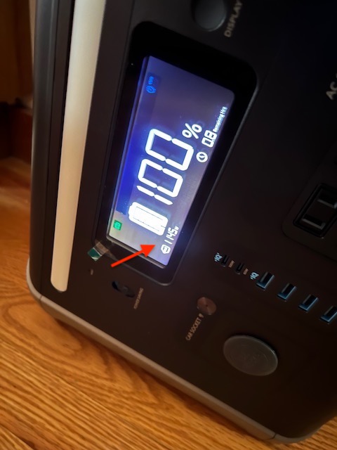
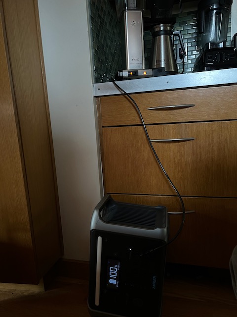
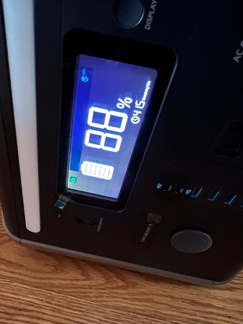
Last year I bought a big portable battery system for running video gear in the field but it’s gotten the most usage here at the house during outages. We mostly use it to run the blower on a small gas furnace to keep the house warm. Out of curiosity (and delicious anticipation), I also used it to run the coffeemaker. I obviously could have boiled water another way and made pour over but I wanted to see how much of the battery that everyday task would take.
 |
 |
 |
|---|
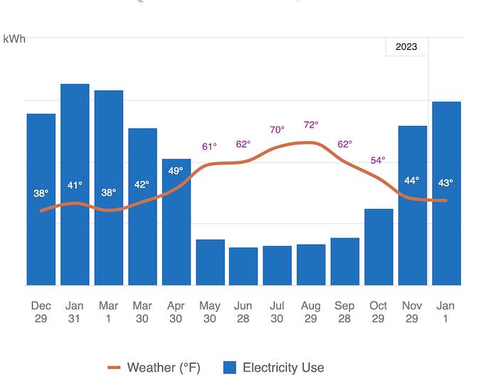
Seeing the coffeemaker draw 1145W on the battery display and watching the battery drop got me thinking about how clear that data is about our energy usage compared to the graphs at the end of the month from the electric and gas companies. While making coffee like this the grid is easy to see and understand - it’s the battery and our coffeemaker. What does the grid look like when the lights come back on?
The simplest difference between the battery counting down the precious energy I have stored and the monthly bills is the graphs just go upwards at the same rate even if I ran something stupid in my basement - like a crypto mining operation1.
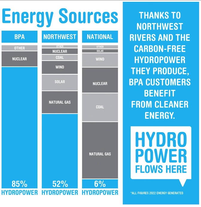
In the PNW, most of our grid energy comes from renewable sources2, but they’re not limitless. A hydro-dam is basically a big battery with all the potential energy measured by the water upstream. Comparing my 1200Wh portable battery to the Bonneville Dam is potentially silly because of the difference in scale3 but both have limits.
There’s no link between what I see on the bill, or in realtime on their websites, and the energy production of those renewable sources. If greener sources are tapped out or offline but demand on the grid rises then gas peaker plants kick on. The power companies are fulfilling their promise to customers that: “I turn on whatever I want, whenever, and y’all figure it out. Oh and bill me the same rate no matter what!”
I know that peak pricing (PGE calls it Time of Day pricing) is one way to encourage people to think about usage. Maybe we should switch to see what it’s like but since we don’t have solar for the house or a battery system to draw on during peak hours I don’t think it makes sense. We’re currently enrolled in the 100% renewable program4 for a slightly higher kWh rate but there’s no additional incentive to actually reducing usage. The program reminds me of Jevons paradox where now that the energy is all green, reducing usage doesn’t feel like it matters as much.
What I’m mostly considering after the storm (beyond the fragility of infrastructure) is looking at better ways to see the energy we’re actually using - hopefully prompting us to go beyond simply remembering to turn off unused things. Low Tech magazine’s solar powered website is an excellent example of finding ways to make energy usage visible. I want to find more ways to link that battery experience with the real, but basically invisible, batteries in the grid.
-
Spoiler: I do not. ↩
-
The website says the dam can generate 1218MW or “enough electricity to power approximately 900,000 homes, or a city the size of Portland.” ↩
-
The program name seems to have gone through committee “Green Future Choice Renewable Power” ↩